
Table of Contents
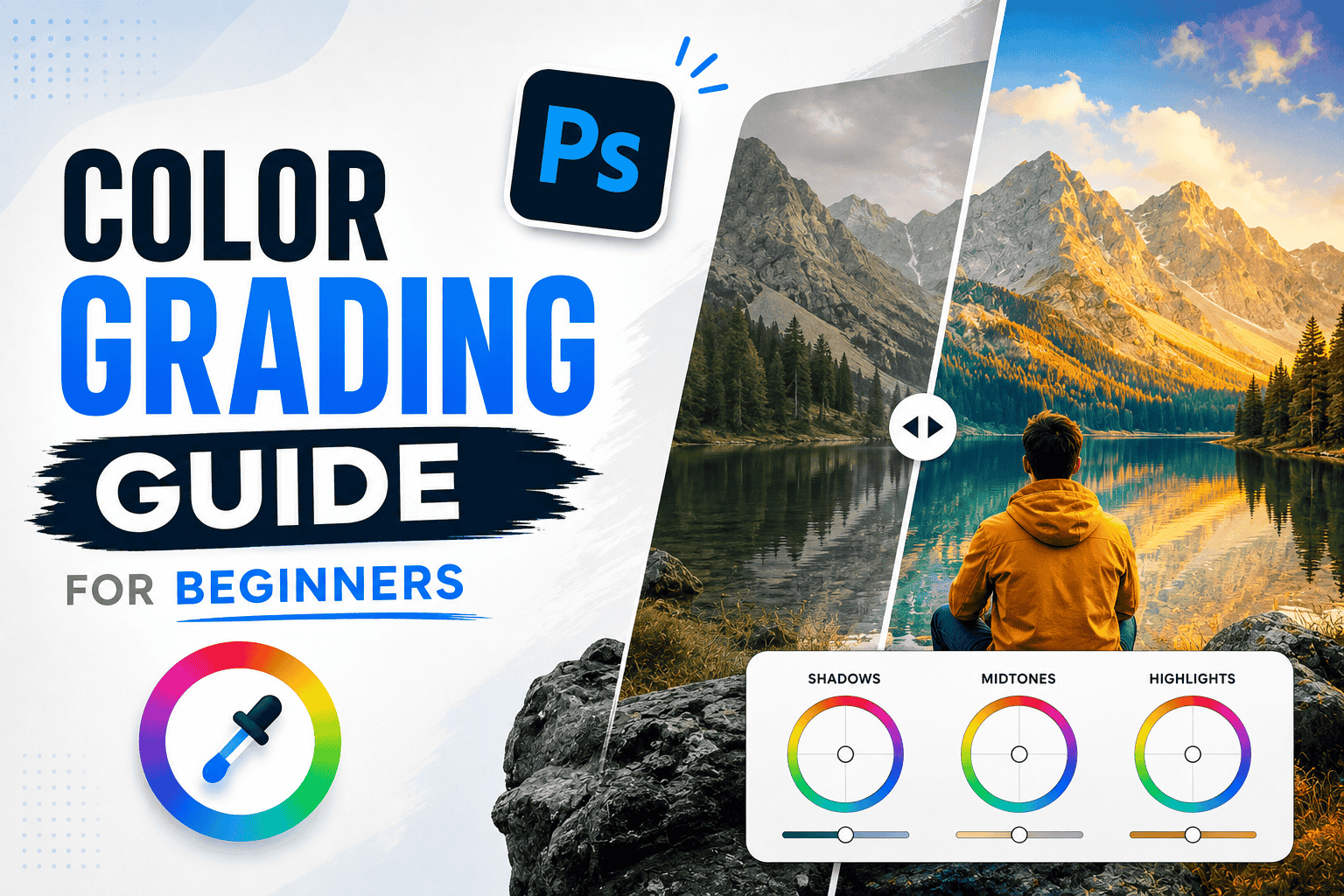
Color grading is one of the most important steps in photo and video editing. It can completely change the mood, atmosphere, and visual style of your content. From cinematic movies to Instagram reels, professional creators use color grading to make their visuals more attractive and consistent.
If you're new to color grading, don't worry. You don't need to be an expert to get started. In this beginner-friendly guide, we'll explain what color grading is, how it works, and how you can create better-looking photos and videos.
.jpg)
What Is Color Grading?
Color grading is the process of adjusting the colors, tones, contrast, and overall appearance of an image or video to achieve a specific visual style.
For example, you can use warmer tones to create a cozy feeling or cooler tones for a dramatic and cinematic look.
Color grading is commonly used for:
- Photography
- YouTube videos
- Instagram Reels
- Movies and short films
- Advertisements
- Travel videos
- Social media content
Color Correction vs. Color Grading
These two terms are often confused, but they have different purposes.
Color Correction
Color correction focuses on making footage look natural and balanced. It usually involves fixing:
- White balance
- Exposure
- Brightness
- Contrast
- Skin tones
- Color inconsistencies
Color Grading
Color grading comes after correction and focuses on creating a particular mood or visual style.
In simple terms: color correction fixes the image, while color grading gives it a creative look.
.jpg)
Basic Elements of Color Grading
Understanding a few basic controls will make color grading much easier.
Exposure
Exposure controls how bright or dark your image appears. Avoid making an image extremely bright or dark because it can remove important details.
Contrast
Contrast controls the difference between bright and dark areas. Increasing it can create a stronger and more dramatic appearance.
Saturation
Saturation controls the intensity of colors. Too much saturation can make an image look unnatural, while too little can make it appear dull.
Temperature
Temperature controls whether an image looks warmer or cooler.
- Warm tones: yellow, orange, and red
- Cool tones: blue and cyan
Tint
Tint adjusts the balance between green and magenta. It's particularly useful when correcting unusual color casts.
How to Color Grade Step by Step
Step 1: Correct Your Exposure
Before adding a creative look, make sure your image has balanced exposure. Recover highlights when necessary and brighten shadows without losing detail.
Step 2: Fix White Balance
Adjust temperature and tint until whites and skin tones appear natural. This gives you a clean starting point for creative grading.
Step 3: Adjust Contrast
Add enough contrast to give your image depth, but avoid crushing shadows or losing highlight details.
Step 4: Adjust Colors
Fine-tune saturation and individual colors to achieve the look you want. You can make certain colors more prominent while reducing distracting tones.
Step 5: Create a Creative Look
Now you can experiment with warm, cool, cinematic, vintage, or other color styles.
Step 6: Check Skin Tones
If people are present, pay special attention to their skin tones. A strong color grade shouldn't make skin look unnatural.
Step 7: Compare Before and After
Turn your adjustments on and off to see whether the grade actually improves the image. Sometimes subtle changes produce the best results.
.jpg)
Popular Color Grading Styles
Cinematic Color Grade
Cinematic grading often uses controlled contrast and complementary colors to create a dramatic film-like appearance.
Warm and Cozy Look
Warm highlights and natural contrast can make photos feel comfortable, energetic, and inviting.
Cool and Moody Look
Blue and cyan tones can create a calm, mysterious, or dramatic atmosphere.
Vintage Look
Reduced saturation, softer contrast, and slightly faded colors can give your content an old-film appearance.
Best Color Grading Software
You can practice color grading with many different editing applications.
Popular options include:
- Adobe Lightroom
- Adobe Photoshop
- DaVinci Resolve
- Adobe Premiere Pro
- Final Cut Pro
- CapCut
Beginners can start with simpler applications before moving to advanced professional software.
.jpg)
Common Color Grading Mistakes
Avoid these mistakes when you're learning:
- Using excessive saturation
- Making skin tones unnatural
- Crushing shadows
- Overexposing highlights
- Applying the same preset to every image
- Using too many colors
- Ignoring the original lighting
The goal isn't to make every color extremely strong. Good color grading should support the image rather than distract from it.
Tips for Better Color Grading
- Start with subtle adjustments.
- Always correct exposure first.
- Keep skin tones natural.
- Use reference images for inspiration.
- Don't rely completely on presets.
- Check your final image on different screens.
- Maintain a consistent style across a project.
- Practice with different lighting conditions.
Frequently Asked Questions
Is color grading difficult for beginners?
No. Once you understand exposure, contrast, temperature, saturation, and color balance, you can start creating your own looks with regular practice.
What is the best software for color grading?
DaVinci Resolve is a powerful option for video color grading, while Lightroom is popular for photography. Beginners can also use simpler tools such as CapCut.
Should I color correct before color grading?
Yes. Correcting exposure and white balance first gives you a balanced starting point for creative color grading.
How can I get a cinematic color grade?
Start with balanced exposure and contrast, then experiment with complementary colors and controlled saturation. Keep skin tones natural for a more professional result.
Final Thoughts
Learning color grading can dramatically improve the quality of your photos and videos. The key is to understand the fundamentals rather than simply applying heavy filters. Start with exposure and white balance, make subtle color adjustments, and gradually develop a style that fits your content.
With consistent practice, you'll become more confident and capable of creating professional-looking visuals that have a distinct mood and personality.

.png)
Comments (0)
Leave a Reply