


The Perfect Colour Combos One

What is colour combination?
A color combination is when you put two or more colors together because they look good. Color pairings are tools for designers to draw from in posters, Web sites, clothing, home decorating, branding. These combinations adhere to color rules (using colors that are opposite, adjacent to, or different shades of one another).
Four Key Elements of a Great Color Combo
- Balance and Contrast: Colors should complement each other, and not be so bright or vibrant that they hurt the eyes.
- Match Good: The colours will go together fine.
- Express Emotion: Colours do raise feeling one thing or the other. For instance, red is strong, blue is calm.
- Brand Look: Consistently using the same colors allow people to remember a brand.
Why It Is Important?
The right colour is extremely essential. Its purpose is to help people pay attention to your design, comprehend your message, and generate the right feelings. When it comes to business, colors can help establish trust and make you memorable. Selecting smart color makes any design — be it website, banner or ad — beautiful and effective. You see, the right colors can have an effect on how people think and feel about what you have to offer.
Dark Olive Gray-Blush Peach
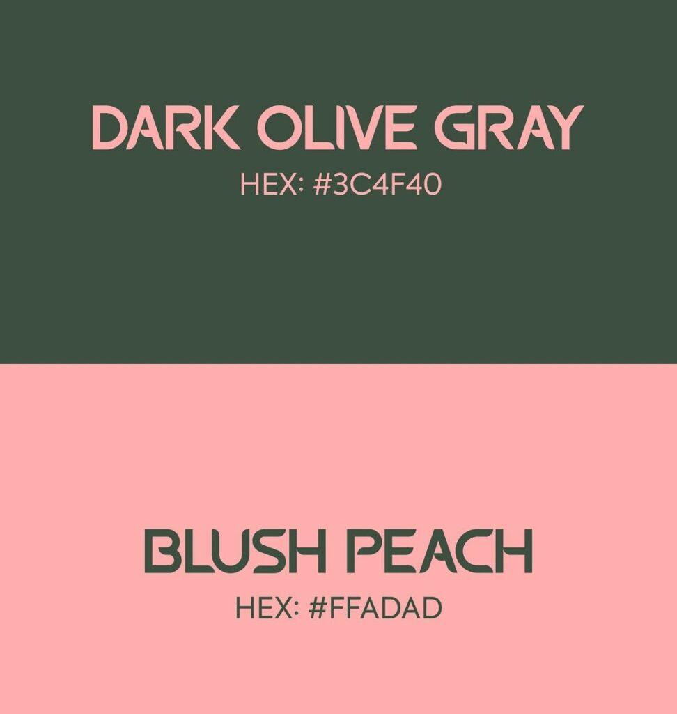
This color pattern consists of Dark Olive Gray (#3C4F40) and Blush Peach (#FFADAD) that mixes earthy richness with tender warmth. The earthy green of Dark Olive Gray provides another classic base with a twist, and the soft Blush Peach provides a welcoming contrast. Paired, they can be bold or understated, perfect for contemporary branding, minimalist design, or lifestyle imagery. The combination work great if you want to show relaxed elegance with warmth touch, it also does a great in fashion look book or wedding invite, feel free to play with the fonts performing as a minimal moodboard. The variation provides contrast while allowing for legibility and an aesthetically-pleasing co-existence.
Tropical Teal-Lush Mint
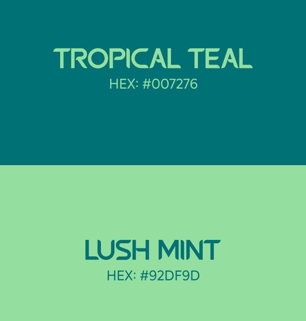
This bold Tropical Teal (#007276) and Lush Mint (#92DF9D) is a refreshing burst of energy with a natural feel to it. Tropical Teal provides depth and luxurious coverage with its deep sea hue, and Lush Mint lightens the palette with a bright, airy pop. When you combine them, you get a dynamic pair that will make your eco-friendly branding, summer designs, wellness campaigns or tech startup feel fresh and alive. The combo is both visually harmonious and high-contrast enough to be legible, while still having a unified color pool in the cool range. It gives freshness and a calm, creativity (perfect for digital and print use).
Midnight Abyss-Royal Gold
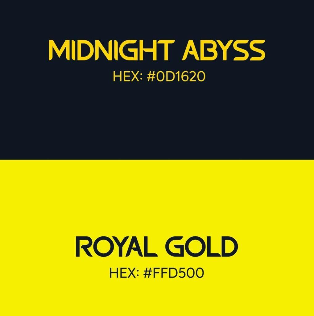
Midnight Abyss (#0D1620) and Royal Gold (#FFD500) This bold colour pairing delivers high contrast in a big way. Midnight Abyss is a deep, nearly-black navy that invites mystery and strength, while Royal Gold is a release of radiant energy and luxury. The combination is suited well for designs that need to be loud and elegant at the same time Eventposters high-class brandinga sporty look for an athlete or nightlife related design. The high degree of contrast gives it both an outstanding readability and visual presence with a very strong character, perfect for any design layout. This pair offers both a formal and light-hearted appeal, and so is favored by modern, confident aesthetics.
Muted Lavender-Soft Rose White
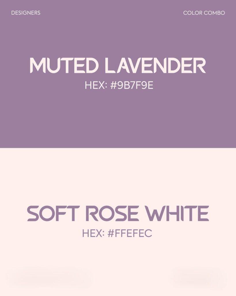
This graceful duo of Muted Lavender (#9B7F9E) and Soft Rose White (#FFEFEC) exudes calm, grace and a touch of vintage appeal. Muted Lavender – A calming, dusted purple Soft Rose White – A creamy, pale warm pink to complement the various tones Muted Lavendertones. They all mix together to form a whimsical and calming palette suited to wedding invitations and more, beauty brands, lifestyle blogs, and whimsical feminine product packaging. Soft contrast = readable but not brutally so, ideal for a soft luxe design look. This combination reflects both tenderness and class, drawing listeners who appreciate the classy and the warm.
Evergreen Moss-Icy Mint
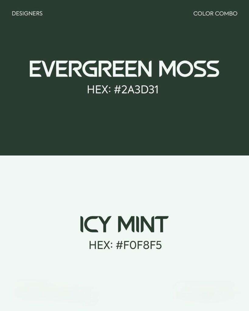
Evergreen Moss (#2A3D31) and Icy Mint (#F0F8F5) Juxtaposition of the deep green and the pastel adds a fresh and natural look to any design that needs eco or wellness spirit. Evergreen Moss contributes a robust, grounded richness imbuing stability, growth + calm, while Icy Mint infuses a fresh, clarifying breath of cool. This balance couple will be useful for minimalistic branding, natural product presentation, healthy & natural life style websites or nature posters and designs. The high contrast makes it easy to read, while its relatively even texture gives it a clean, stable appearance. Together they produce a paired down, yet life-enhancing feel, so this combo would be great for designs that want to feel grounding, yet uplifting, and connected to nature.


vorbelutr ioperbir
April 30, 2025Appreciate it for all your efforts that you have put in this. very interesting information.
Account Alert: 0.4 BTC withdrawal attempt. Deny? > https://graph.org/Get-your-BTC-09-04?hs=5853eb9177c2a9a80ebf95ec0ae3befa&
April 30, 202533rmlr
akongcuan
April 30, 2025I will right away grasp your rss feed as I can’t in finding your email subscription hyperlink or e-newsletter service. Do you’ve any? Please permit me realize so that I could subscribe. Thanks.
7zzz
April 30, 2025Alright alright, 7zzz… short and sweet. Let’s see what they’ve got hidden in the menu. Anyone know if they are legit? Find them here: 7zzz
j777loginregister
April 30, 2025J777loginregister, it’s a mouthful, but getting signed up was pretty straightforward. Not bad for a quick game. Have a look for yourself: j777loginregister
the brain song
April 30, 2025Hi there, I discovered your site by the use of Google even as looking for a related topic, your website got here up, it seems to be good. I’ve bookmarked it in my google bookmarks.
honey trick for memory loss
April 30, 2025I enjoy what you guys are usually up too. This type of clever work and exposure! Keep up the superb works guys I’ve you guys to our blogroll.
pink salt trick
April 30, 2025I discovered your blog site on google and check a few of your early posts. Continue to keep up the very good operate. I just additional up your RSS feed to my MSN News Reader. Seeking forward to reading more from you later on!…
odds96pwaapp
April 30, 2025Odds96pwaapp, the PWA version is convenient for quick access on desktop. Not as feature-rich as the native app, but handy nonetheless. Check it out if you don’t want to download anything. odds96pwaapp.
jili333login
April 30, 2025Jili333login time! Gonna get my daily dose of slots in. Always hoping for a big win! Just login here: jili333login
999exchangebet
April 30, 2025999exchangebet! That number sequence makes me think I’m about to win big. Has anyone used their exchange? Is it smooth and reliable? Important things, right? Check it out for yourself: 999exchangebet
togel 4d
April 30, 2025magnificent points altogether, you just gained a new reader. What would you recommend about your post that you made some days ago? Any positive?
betgorila
April 30, 2025Just had a punt on betgorila. Not bad at all! Good odds and the site’s pretty responsive. Might stick around here for a bit. Take a look: betgorila
jlsss1
April 30, 2025Dude, I just started using jlsss1 and it’s pretty slick! So many options. Definitely checking it out more. jlsss1
tipobet5910casino
April 30, 2025Anyone makin’ bank over at tipobet5910casino? Just curious to see if it’s worth my time. Good luck to everyone out there!
cashhoardslot
April 30, 2025Hey! Recently gave cashhoardslot a spin. It seems like a niche slot game, definitely seems designed for a certain type of player. I want to try some more slots later cashhoardslot.
t777
April 30, 2025t777 https://www.adt777.org
jililph
April 30, 2025jililph https://www.jililphu.org
fdertol mrtokev
April 30, 2025you’ve got an amazing blog here! would you wish to make some invite posts on my weblog?
Bot Tracker
April 30, 2025Thanks for sharing excellent informations. Your web-site is very cool. I’m impressed by the details that you have on this website. It reveals how nicely you perceive this subject. Bookmarked this website page, will come back for more articles. You, my friend, ROCK! I found simply the info I already searched all over the place and just could not come across. What a perfect website.