


How to Choose the Right Fonts for Your Designs?
Fonts play a crucial role in design. The right font can make your design look professional and attractive, while the wrong font can ruin its impact. Whether you are designing a website, logo, banner, or invitation card, choosing the right font is essential. In this article, we will guide you on how to select the best fonts for your designs.
Understand Your Design Purpose
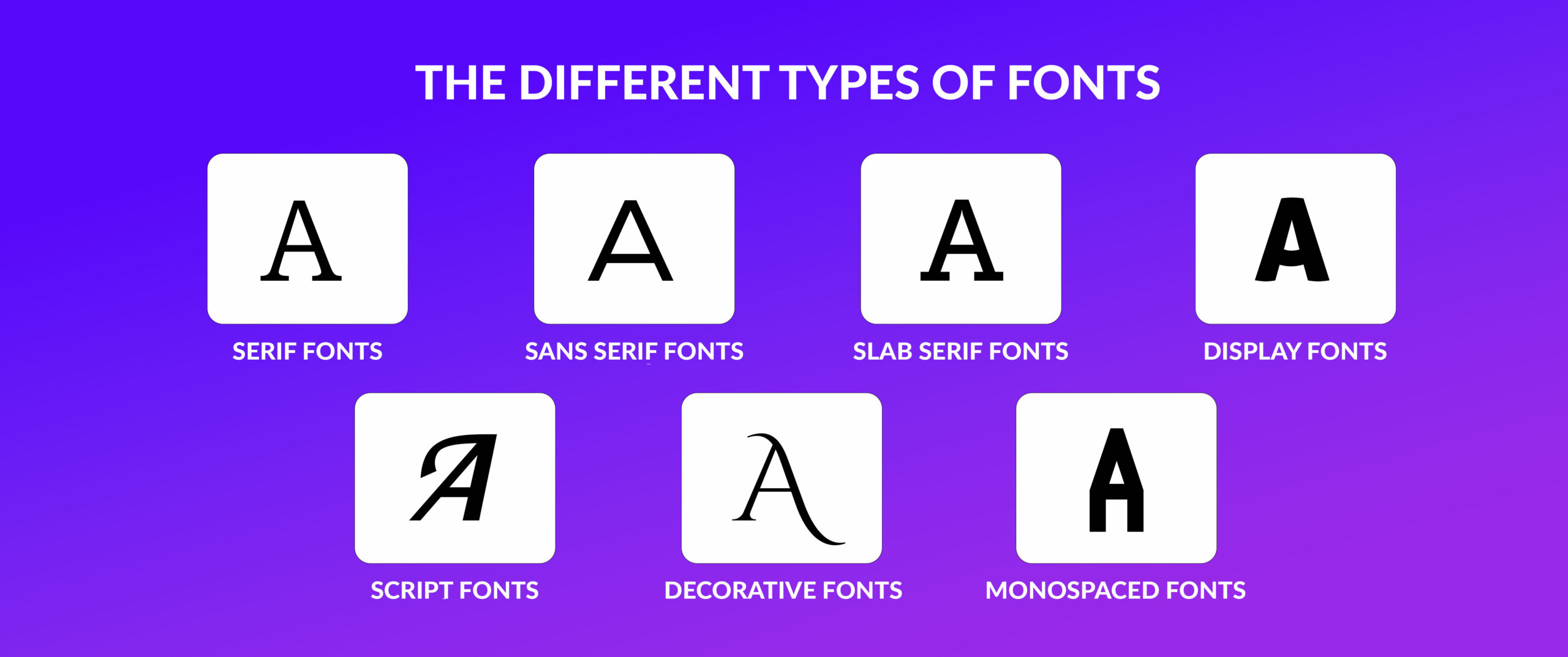
Before selecting a font, think about the purpose of your design. Are you designing for a business, an event, or a personal project? Different projects require different font styles. For example:
- Business websites and logos need professional fonts like Helvetica, Roboto, or Times New Roman.
- Event invitations often look better with elegant fonts like Script or Calligraphy styles.
- Social media posts may require bold and eye-catching fonts like Impact or Bebas Neue.
Choose Readable Fonts
Readability is key. If your audience cannot read your text easily, your design will fail. Here are some tips:
- Avoid overly decorative fonts for body text.
- Use Sans-serif fonts like Arial or Open Sans for clear and clean looks.
- Ensure proper spacing between letters and lines.
Match the Font to Your Brand or Theme
Your font should reflect the message and style of your brand or theme. For example:
- A luxury brand may use stylish serif fonts like Playfair Display.
- A tech company may use modern sans-serif fonts like Montserrat.
- A kids’ event poster may use playful and fun fonts like Comic Sans or Poppins.
Limit the Number of Fonts
Using too many fonts can make your design look messy. Stick to 2-3 fonts per design:
- Use one font for headings.
- Another font for body text.
- Optionally, a third font for special elements like quotes or call-to-action buttons.
Use Font Pairing Wisely
Some fonts look great together, while others do not. Here are some popular font pairings:
- Lora (serif) + Open Sans (sans-serif) – Classic and professional.
- Playfair Display (serif) + Montserrat (sans-serif) – Elegant and modern.
- Raleway (sans-serif) + Roboto Slab (serif) – Minimalist and clean.
Test Your Fonts Before Finalizing
Always test how your fonts look in your design. Try different font sizes and styles. Check how they appear on different devices (mobile, tablet, desktop). Ensure the font maintains its readability and aesthetic appeal.

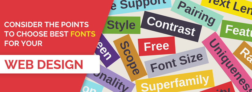
Consider Web and Print Compatibility
Some fonts look good on screens but not in print. Make sure the font you choose works well for both. Google Fonts is a great resource for web-friendly fonts.
Avoid Overused Fonts
Fonts like Times New Roman, Arial, and Comic Sans are overused. While they have their place, using fresh fonts can make your design stand out.
Conclusion
Choosing the right font is essential for creating stunning and effective designs. Always consider readability, brand identity, and font pairings to make your work professional and appealing. Experiment with different fonts, but keep your design simple and clean.
By following these tips, you can ensure that your designs look stylish, readable, and effective. Happy designing!


vorbelutr ioperbir
January 24, 2025F*ckin’ tremendous issues here. I am very satisfied to see your post. Thanks so much and i’m having a look ahead to contact you. Will you please drop me a e-mail?
Kerassentials
January 24, 2025Pretty great post. I just stumbled upon your weblog and wanted to say that I’ve truly loved surfing around your weblog posts. In any case I will be subscribing to your rss feed and I hope you write once more very soon!
slot
January 24, 2025Hi there! Do you know if they make any plugins to safeguard against hackers? I’m kinda paranoid about losing everything I’ve worked hard on. Any recommendations?
nextogel
January 24, 2025Hey very cool blog!! Guy .. Beautiful .. Amazing .. I will bookmark your web site and take the feeds additionally…I’m glad to find numerous helpful information here in the put up, we’d like work out extra strategies on this regard, thank you for sharing.
nextogel
January 24, 2025I like the valuable info you provide in your articles. I will bookmark your blog and check again here regularly. I’m quite certain I will learn many new stuff right here! Good luck for the next!
Gelatin Trick
January 24, 2025We are a group of volunteers and opening a new scheme in our community. Your site provided us with useful info to paintings on. You’ve performed an impressive activity and our whole group will likely be grateful to you.
zalv8
January 24, 2025Zalv8, quick punt on this one. Seemed legit, nothing dodgy. Usual array of games and slots. Might be worth a look if you can’t find anything else: zalv8
bet669login
January 24, 2025Logging in to bet669login is so quick and seamless. No hassle at all! Ready to get my game on! Login and play there: bet669login
505betapp
January 24, 2025Download the 505betapp.info app! Seriously, it’s pretty convenient. I can place bets on the go, and the interface is sleek. Good stuff. 505betapp
99ok123
January 24, 2025Had a look at 99ok123 and all the games look proper! I may spend more time on this site in the future, for sure. Top notch!
situs slot
January 24, 2025I carry on listening to the reports speak about getting boundless online grant applications so I have been looking around for the most excellent site to get one. Could you advise me please, where could i acquire some?
667betloginentrar
January 24, 2025Yo, having trouble logging in? 667betloginentrar has the link to help. Easy peasy. Go here: 667betloginentrar
pub774
January 24, 2025Pub774! Wondering if this is just another site or if it’s actually legit. Gotta try my luck and see. Here’s the link: pub774
fdertolmrtokev
January 24, 2025I just like the helpful information you provide to your articles. I’ll bookmark your blog and test again here regularly. I am moderately certain I’ll be informed lots of new stuff proper here! Good luck for the following!
cx777
January 24, 2025cx777, aight, that’s a solid place to land. No complaints here. Pop over to cx777
alquiler motos las palmas
January 24, 2025Someone necessarily assist to make seriously posts I might state. That is the first time I frequented your web page and thus far? I surprised with the analysis you made to make this actual post amazing. Wonderful job!
ftrgame01
January 24, 2025Checked out ftrgame01 and I’m not disappointed. It has the perfect amount of thrill and excitement for me. Def one of the finest games out there ftrgame01
zaborna torilon
January 24, 2025As a Newbie, I am constantly browsing online for articles that can benefit me. Thank you
jl999
January 24, 2025jl999 https://www.itjl999.com
लाइव पोर्न वीडियो
January 24, 2025Great website. Plenty of useful information here. I?¦m sending it to some friends ans additionally sharing in delicious. And of course, thank you to your effort!
kedarnath siva
January 24, 2025Merely wanna state that this is extremely helpful, Thanks for taking your time to write this.
17mex
January 24, 2025Yo fam, ever heard of 17mex? I’m seeing what the buzz is about. Give it a whirl, why not? 17mex
neu88net
January 24, 2025Been playing on neu88net for a while now. Pretty decent, honestly. Game selection is solid and I haven’t had any major issues withdrawing. Could be better, but it’s worth checking out. neu88net
plataformasbet.net
January 24, 2025Plataformasbet.net has a lot going on, lots of different betting options. Can be a little overwhelming at first, but once you get used to the layout, it’s pretty user-friendly. Worth checking out if you like variety. plataformasbet
jl333
January 24, 2025[7987]jl333 Online Casino Philippines: Best Slots, Easy Login, Register & App Download Join JL333 Online Casino Philippines for the best JL333 slot games. Quick JL333 login, easy JL333 register, and secure JL333 download for mobile play. Sign up today! visit: jl333
fdertolmrtokev
January 24, 2025Heya i’m for the first time here. I found this board and I find It really useful & it helped me out a lot. I hope to give something back and aid others like you aided me.
Bot Tracker
January 24, 2025Greetings! Very helpful advice on this article! It is the little changes that make the biggest changes. Thanks a lot for sharing!