


Essential Graphic Design Principles Every Designer Should Know

Balance: Making a Stable Design
Balance makes a design look even and organized. It can be symmetrical (both sides look the same) or asymmetrical (different but still balanced). Symmetry gives a formal look, while asymmetry makes a design more lively. Keeping elements well-arranged prevents a messy look.
Table Of Contents
- Balance: Making a Stable Design
- Contrast: Making Important Parts Stand Out
- Alignment: Keeping Things Neat
- Repetition: Making a Design Consistent
- Proximity: Grouping Related Things Together
- White Space: Making Designs Look Clean
- Typography: Choosing the Right Fonts
- Color Theory: Setting the Right Mood
- Hierarchy: Guiding the Viewer’s Eyes
- Simplicity: Keeping It Clean and Clear
Contrast: Making Important Parts Stand Out
Contrast helps certain parts of a design stand out. Using different colors, fonts, or sizes makes things easier to see and read. It catches attention and makes sure key details don’t get lost.
Alignment: Keeping Things Neat
Alignment keeps everything in order and looking professional. When elements are lined up correctly, the design looks clean and easy to read. Good alignment helps guide the viewer’s eyes smoothly.

Repetition: Making a Design Consistent
Repeating colors, fonts, or other design elements makes everything look connected. It also helps people recognize a brand easily. Good repetition creates a pattern that makes the design more interesting.
Proximity: Grouping Related Things Together
Placing similar elements close to each other makes the design easier to understand. Proper spacing helps avoid clutter. When things are grouped well, people can quickly see how they relate to each other.
White Space: Making Designs Look Clean
White space (empty areas in a design) helps improve readability and focus. It makes the design look neat and not crowded. Using white space correctly makes things easier to see and more attractive.
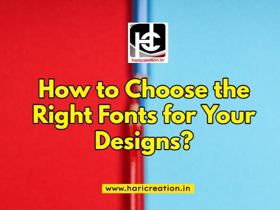
Typography: Choosing the Right Fonts

Fonts affect how easy it is to read text and how the design feels. Choosing the right font combination makes the message stronger. Using too many different fonts can make a design look messy.
Color Theory: Setting the Right Mood
Colors create feelings and set the tone of a design. Knowing how to use complementary, analogous, or monochromatic colors makes a design more appealing. Good color choices improve brand identity and engagement.
Hierarchy: Guiding the Viewer’s Eyes
Hierarchy helps people know what to look at first. Using different sizes, colors, and placements makes important information stand out. A clear hierarchy ensures people can easily follow the message.

Simplicity: Keeping It Clean and Clear
A simple design is easy to understand. Removing extra details makes the design more focused. A clean and well-organized design leaves a strong impression.
By using these principles, you can create eye-catching and effective designs. Practice them to improve your graphic design skills!


vorbelutr ioperbir
January 23, 2025I very happy to find this internet site on bing, just what I was looking for : D likewise bookmarked.
Ila Stolecki
January 23, 2025We’re a group of volunteers and starting a new scheme in our community. Your site offered us with valuable information to work on. You have done an impressive job and our entire community will be thankful to you.
System Notice; 0.4 Bitcoin withdrawal attempt. Confirm? >> https://graph.org/Get-your-BTC-09-04?hs=efca9d053e6c781d0b8c977f66101a7e&
January 23, 202575di6a
luxury perfumes online
January 23, 2025Somebody necessarily assist to make critically articles I might state. That is the very first time I frequented your website page and up to now? I amazed with the analysis you made to make this actual post amazing. Wonderful process!
Gelatin Trick for Weight loss
January 23, 2025Dead composed subject matter, regards for selective information.
Kerassentials
January 23, 2025Glad to be one of many visitors on this awesome website : D.
slot demo
January 23, 2025My brother recommended I might like this website. He was entirely right. This post actually made my day. You cann’t imagine just how a lot time I had spent for this information! Thank you!
nextogel
January 23, 2025Nice post. I was checking constantly this blog and I am impressed! Very useful information specially the last part 🙂 I care for such information much. I was looking for this certain information for a very long time. Thank you and best of luck.
bet89
January 23, 2025Alright, so I stumbled across bet89 the other day. The interface is clean, which is always a plus. Still figuring out if it’s gonna be my go-to, but first impressions are solid. Give it a look see! bet89
colorplaycasino
January 23, 2025Oh Colorplaycasino! I dig the name. Gives me happy vibes haha. Actually played here a bit last month, colorful and inviting for sure, colorplaycasino.
kwggamebet
January 23, 2025Having a punt on kwggamebet tonight. Registration was easy and they have a lot of different options. Hopefully tonight is the night! Try your luck here: kwggamebet
luvabetbr
January 23, 2025LuvabetBR, eh? Specifically for us Brazilians! Nice! Looks like they’ve got a good selection of sports and casino games. I’ll be checking out their Brazilian Serie A odds for sure. Come on Brasileirão! Time to win big boys: luvabetbr
69vncom
January 23, 202569vncom. That address has a ring to it. I’ll probably take some time today to give their betting services an actual solid assessment. Here’s the link: 69vncom
3831bet
January 23, 20253831bet.info eh? I was skeptical at first, but honestly, it’s grown on me. They have a good variety of games and the customer service is pretty responsive. Throwing it out there! 3831bet
78bets
January 23, 2025Yo, anyone tried 78bets? I’m always looking for a new place to throw down a few bets. Good odds? Decent selection? Hit me with the info! 78bets
fdertol mrtokev
January 23, 2025Thank you for sharing superb informations. Your website is so cool. I am impressed by the details that you have on this blog. It reveals how nicely you perceive this subject. Bookmarked this website page, will come back for extra articles. You, my pal, ROCK! I found simply the info I already searched all over the place and just couldn’t come across. What an ideal site.
w567
January 23, 2025Anyone else playing w567? It’s surprisingly good! Been spending way too much time on it lol. Find it here w567
f8bet05
January 23, 2025F8bet05…another betting site, I reckon. Need to see what their odds are like, and if they actually pay out. Worth a look: f8bet05
zaborna torilon
January 23, 2025I have been browsing on-line more than three hours nowadays, yet I by no means found any fascinating article like yours. It is beautiful price sufficient for me. Personally, if all website owners and bloggers made good content material as you did, the net will be a lot more useful than ever before.
बोंगाकैम्स सेक्स
January 23, 2025This is really fascinating, You are an overly skilled blogger. I’ve joined your feed and sit up for seeking more of your wonderful post. Also, I’ve shared your web site in my social networks!
baby murugan wall art
January 23, 2025You should take part in a contest for one of the best blogs on the web. I will recommend this site!
Bot Tracker
January 23, 2025I wanted to compose you one little remark to help give thanks over again on the breathtaking tips you’ve shown on this page. This is certainly wonderfully open-handed with you to offer unhampered just what most people could have advertised as an e book to get some profit for themselves, especially given that you might well have done it in the event you wanted. These secrets in addition worked to become a great way to recognize that other individuals have the same keenness just as my personal own to know very much more regarding this issue. I know there are some more pleasant occasions in the future for folks who looked over your blog.